UX DESIGN
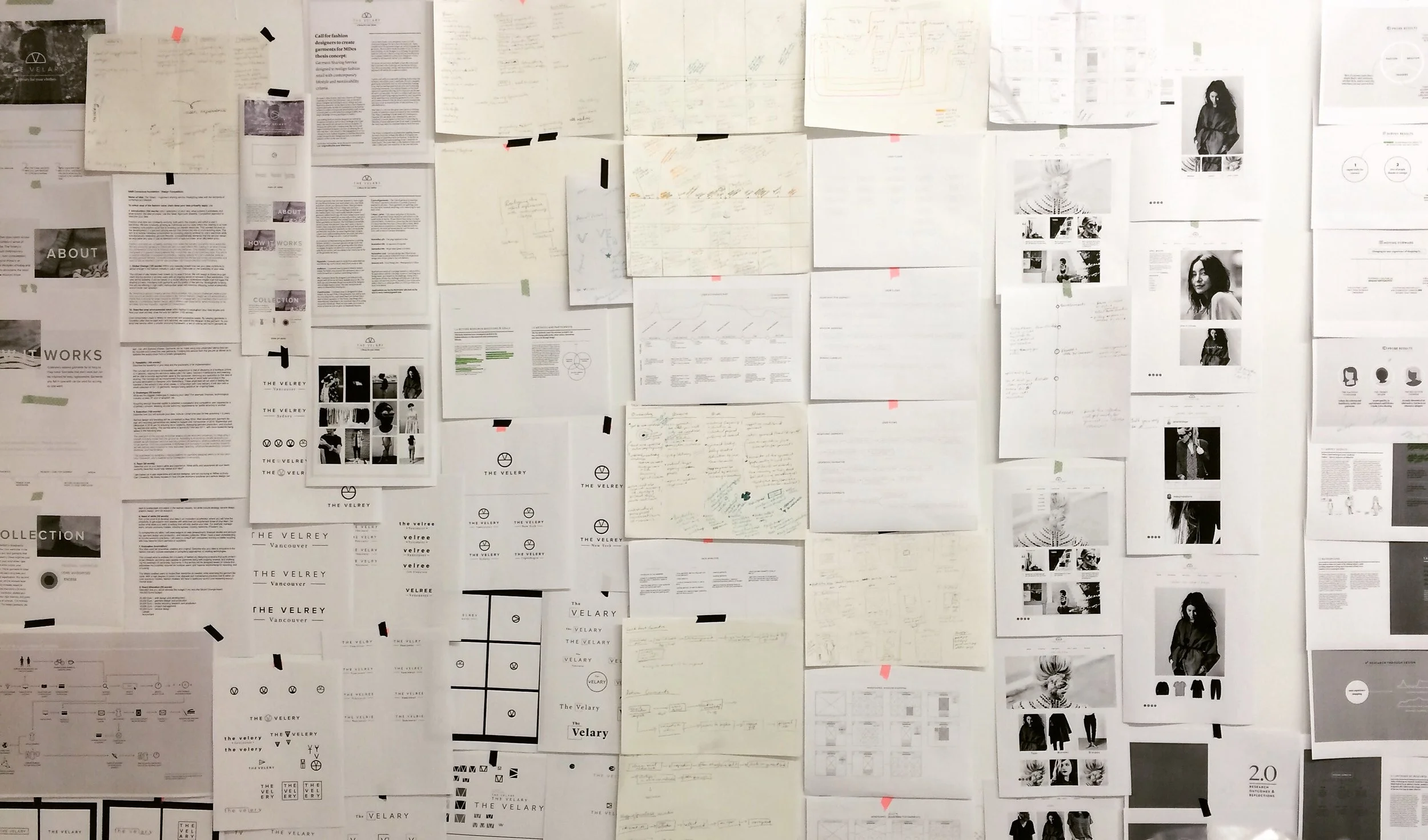
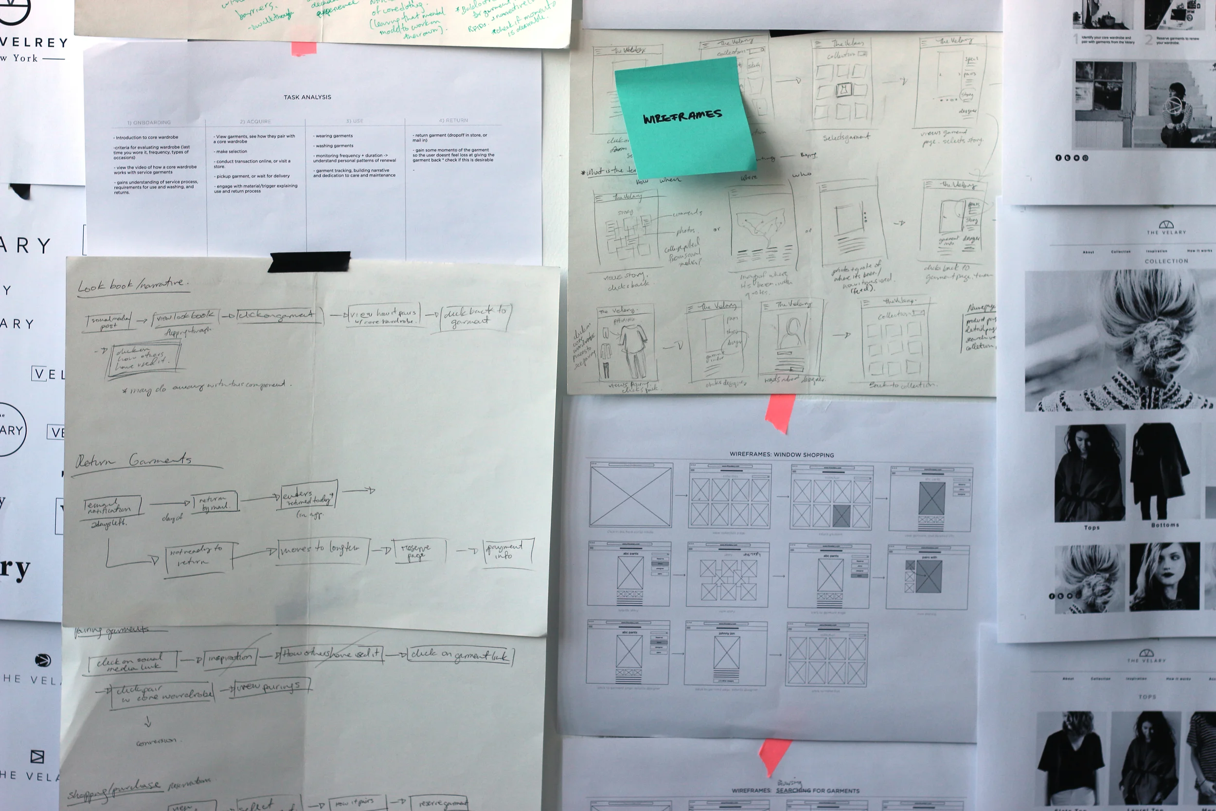
User experience design was used in conjunction with service design methodologies to ensure the design meets user criteria derived from primary research conducted during the summer. UX methodologies spanned both strategic and technical design outputs, delivering a user experience map used to design the service and to design individual touchpoints such as web design. User experience design acted as the cornerstone for design deliverables, and provided both strategic foresight and grounding in user research. The nature of interdisciplinary design in this project has illuminated how service design, UX, IXD, and UI design intersect. In a conversation with my supervisor Haig Armen, we mapped this funnel. Our observations eluded to service design forming the overarching strategy and intention of a design. While user experience focuses on the user flows, needs, expectations, and experiences both online and offline. Interaction design pertains to the functional design of digital products integrating both UX and UI criteria and methodologies. And finally UI consolidates the strategy and research from the above disciplines into visual form.
USER INTERFACE DESIGN & PROTOTYPING
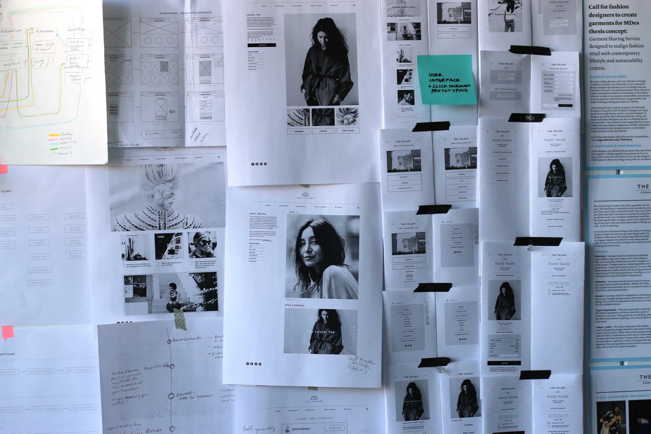
The user interface design of the web component of this project has drawn heavily from Google’s Material Design principles. Evolving the visual design from brand to UI, the cleanliness and purpose behind material design have been vital. While there is a valuable narrative behind the concept, the design elements have been developed for accessibility, and easy on-boarding. There is a high level of functionality outlined in the visual design of the website. While this has led to an effective web prototype and clear user flows, it has also illuminated the need for an integration of layered information and story at the information architecture level, which will be executed in the form of the blog content, and garment history.
WORKING FROM FLOWS
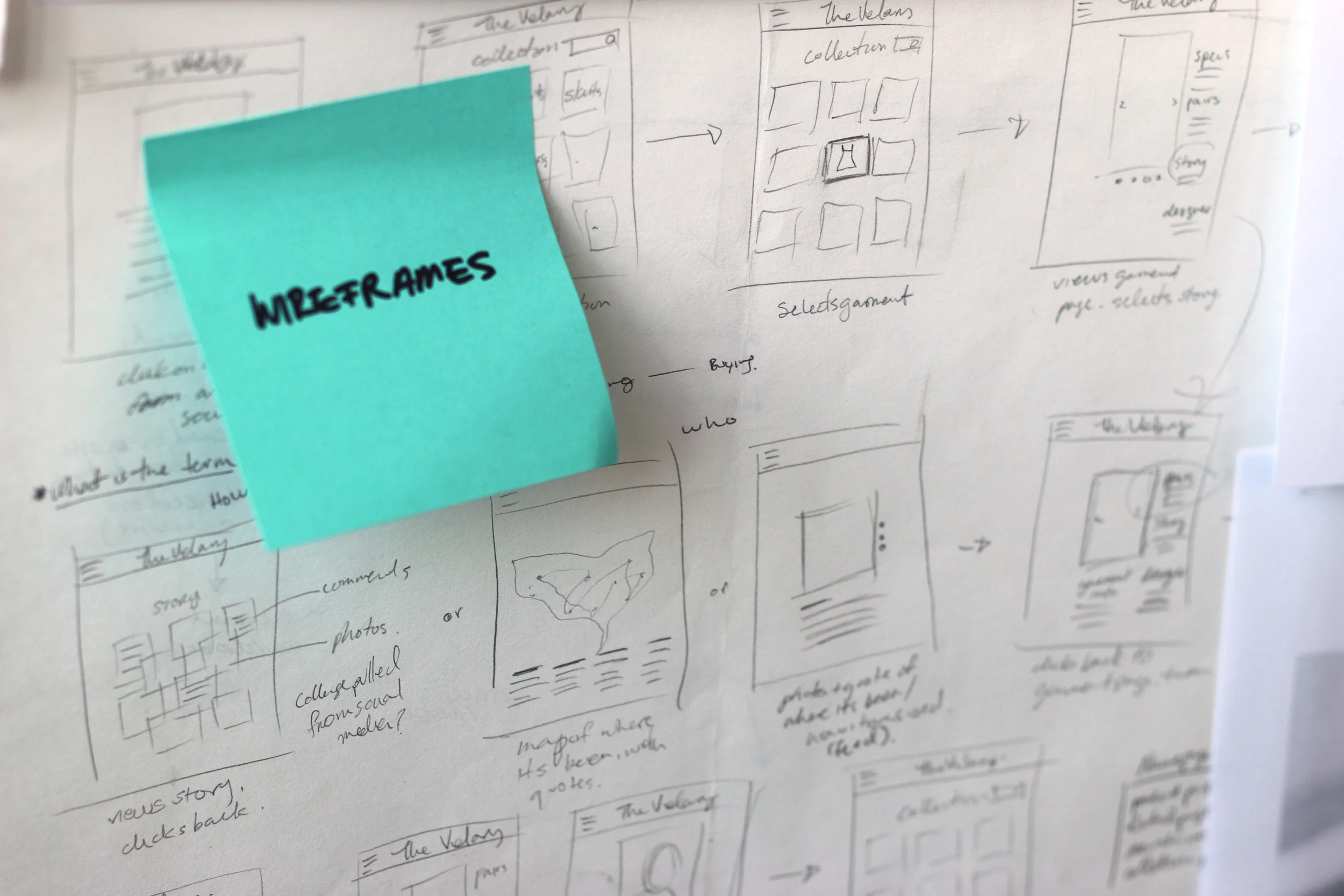
Designing the UX strategy and then moving to flows and interactions has meant that the site prototype, and individual user tasks are all extensions of the original strategy. The design of the mobile site was derived from a user flow of checking out a garment. The site architecture is fundamentally in effect, but continues to be added to as more user flows are integrated. This has allowed for user testing and continued iteration to fully inform the way the site is built out.
USER TESTING
In order to gain insight into the user experience design of the website, in terms of both functionality and enjoyability, I conducted user testing with seven participants. Participants included probe respondents who had previous knowledge of the thesis research intentions, and new student participants who were less involved in the study. I was looking to determine the effectiveness of learnability and memorability, functionality and errors, and satisfaction. I conducted preliminary user testing through observing how users interacted with my first clickable prototype, and then transitioned to task based testing with a second more refined prototype. I asked participants to complete four tasks including to find a garment, check out a garment, return a garment, and login. I also asked participants to discover what the service does through website copy and summarize it in their own words.
The key insights from user testing were that in terms of functionality, there were few errors, namely in the split of the menu for navigation, and the process of logging in as a new user, as the prototype was not set up to have new information entered by users. Overall users were able to complete all tasks assigned. Users also frequently commented on the visual design, and described it as “beautiful” and refined enough that it made them feel as if the website was live, not a clickable prototype. In the user testing process they were finding moments of delight.
I tested with both designers and non-designers and found that the latter made better testing subjects as they tended to not bring fewer biases when completing tasks. I found that when testing designers they would leap to summarizing their experience or making suggestions before they had completed a task, so it was harder to glean accurate functionality from their participation.
The aspect of the site that was identified as needing the most clarity was in communicating the concept of the service, and how it works. Most users still had questions after reading the about and how it works sections, and requested either an FAQ section or more narrative forms of communicating like on-boarding videos (which had not been completed to date for this prototype).
